I see a lot of developers reach for ConstraintLayout for everything. Login screen with three centered fields? ConstraintLayout. Simple vertical list? ConstraintLayout. Sometimes it's the right call, sometimes it's overkill.
Here's my take on when ConstraintLayout actually helps and when you're making things more complicated than they need to be.
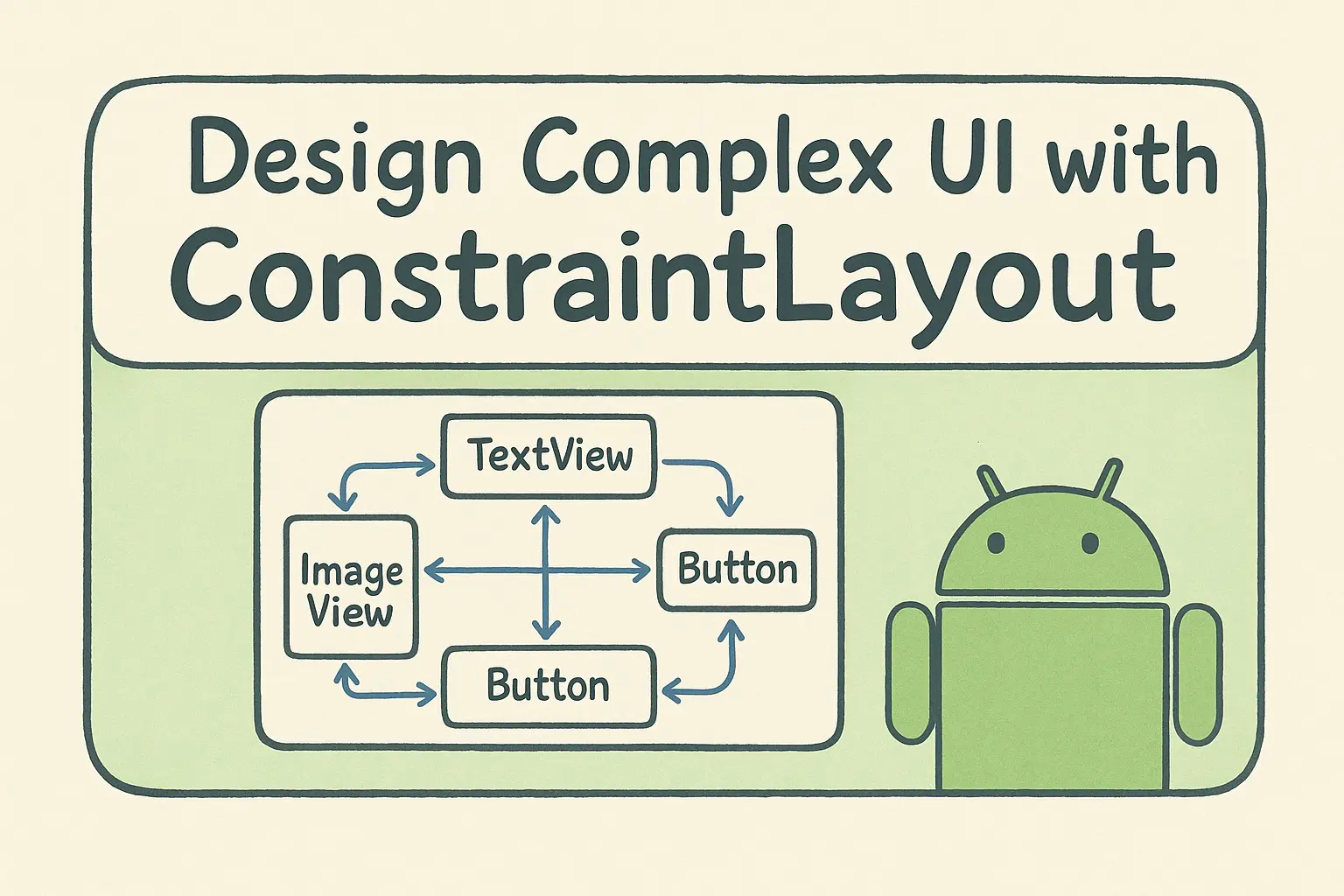
What ConstraintLayout Actually Does
The basic idea: instead of nesting layouts inside layouts, you define relationships between views. "This view's top is 16dp below that view's bottom." "This view is centered horizontally in its parent." The layout system solves all these constraints to figure out where everything goes.
Under the hood, it builds a system of linear equations from your constraints and solves them using a Cassowary-style constraint solver. That's why you can express relationships that would be impossible with nested LinearLayouts.
The practical benefit: you get a flat view hierarchy. Instead of 4-5 levels of nested layouts, you have one ConstraintLayout with all your views as direct children. This matters for performance because every level of nesting adds measure/layout passes.
When ConstraintLayout Makes Sense
Complex cross-axis alignment. When you need to center something vertically while also aligning it to another view's edge horizontally. Try doing that with nested LinearLayouts - it gets ugly fast.
Responsive layouts. Percentage-based sizing, aspect ratios, and bias values let you build layouts that adapt to different screen sizes without writing different XML files.
Replacing deep nesting. If you have a layout that's 4+ levels deep with LinearLayouts and RelativeLayouts, ConstraintLayout can usually flatten it.
Anything you'd use MotionLayout for. MotionLayout extends ConstraintLayout, so you need to understand constraints to animate them.
When Simpler Layouts Are Better
Simple vertical stacks. Three TextViews in a column? Use LinearLayout. The constraint syntax just adds noise.
<!-- Just do this -->
<LinearLayout android:orientation="vertical">
    <TextView android:text="Title" />
    <TextView android:text="Subtitle" />
    <TextView android:text="Description" />
</LinearLayout>
Simple horizontal rows. A Row/Column in Compose or LinearLayout in XML is clearer when you don't need cross-axis positioning.
Quick prototypes. When you're iterating fast, nested layouts are quicker to modify than rewiring constraints.
The Features Worth Knowing
Chains
Chains link views together for distribution. The chain style goes on the first element:
Spread - Equal spacing between views. Good for tab bars.
Spread Inside - First and last views touch the edges, others spaced evenly. Good for toolbars with icons at both ends.
Packed - Views grouped together, can be positioned with bias. Good for centered button groups.
Example - three buttons spread across the width:
<Button
    android:id="@+id/btn1"
    app:layout_constraintHorizontal_chainStyle="spread"
    app:layout_constraintStart_toStartOf="parent"
    app:layout_constraintEnd_toStartOf="@id/btn2" />

<Button
    android:id="@+id/btn2"
    app:layout_constraintStart_toEndOf="@id/btn1"
    app:layout_constraintEnd_toStartOf="@id/btn3" />

<Button
    android:id="@+id/btn3"
    app:layout_constraintStart_toEndOf="@id/btn2"
    app:layout_constraintEnd_toEndOf="parent" />
Guidelines
Invisible lines you can constrain to. Useful for consistent alignment across a screen.
<!-- 30% from the left -->
<androidx.constraintlayout.widget.Guideline
    android:id="@+id/guideline"
    android:orientation="vertical"
    app:layout_constraintGuide_percent="0.30" />

<!-- This image stays in the left 30% -->
<ImageView
    app:layout_constraintStart_toStartOf="parent"
    app:layout_constraintEnd_toStartOf="@id/guideline" />
Barriers
Dynamic positioning based on multiple views. The barrier moves to accommodate whichever view is largest.
<!-- Barrier positioned after the longest label -->
<androidx.constraintlayout.widget.Barrier
    android:id="@+id/labelBarrier"
    app:barrierDirection="end"
    app:constraint_referenced_ids="label1,label2,label3" />

<!-- Input field starts after the barrier -->
<EditText
    app:layout_constraintStart_toEndOf="@id/labelBarrier" />
This is genuinely useful when you have labels of varying lengths and want the input fields to align.
Aspect Ratios
Force a view to maintain proportions:
<ImageView
    android:layout_width="0dp"
    android:layout_height="0dp"
    app:layout_constraintDimensionRatio="16:9"
    app:layout_constraintStart_toStartOf="parent"
    app:layout_constraintEnd_toEndOf="parent" />
The image fills the width and calculates height to maintain 16:9.
Common Mistakes I've Made
Using match_parent instead of 0dp
<!-- Wrong - don't use match_parent in ConstraintLayout -->
<TextView
    android:layout_width="match_parent"
    app:layout_constraintStart_toStartOf="parent"
    app:layout_constraintEnd_toEndOf="parent" />

<!-- Right - use 0dp (MATCH_CONSTRAINT) -->
<TextView
    android:layout_width="0dp"
    app:layout_constraintStart_toStartOf="parent"
    app:layout_constraintEnd_toEndOf="parent" />
match_parent doesn't consider constraints. 0dp means "size me based on my constraints."
Missing constraints
Every view needs at least one horizontal and one vertical constraint. If you only constrain the top, the horizontal position is undefined and the view will jump to 0,0.
<!-- Missing horizontal constraint - view position undefined -->
<TextView
    app:layout_constraintTop_toTopOf="parent" />

<!-- Fixed -->
<TextView
    app:layout_constraintTop_toTopOf="parent"
    app:layout_constraintStart_toStartOf="parent" />
Android Studio shows warnings for this, but they're easy to ignore when you're in a hurry.
Circular dependencies
<!-- These depend on each other - impossible to solve -->
<TextView
    android:id="@+id/text1"
    app:layout_constraintTop_toBottomOf="@id/text2" />

<TextView
    android:id="@+id/text2"
    app:layout_constraintTop_toBottomOf="@id/text1" />
The fix is usually to anchor one view to the parent instead of each other.
Over-constraining
Specifying both a fixed width AND a percentage width creates a conflict:
<!-- Conflicting - which width wins? -->
<TextView
    android:layout_width="100dp"
    app:layout_constraintWidth_percent="0.5" />
Pick one approach. Usually you want 0dp width with either constraints or a percentage.
Real Example: Product Card
Here's a product card that uses several ConstraintLayout features:
<androidx.constraintlayout.widget.ConstraintLayout
    android:layout_width="match_parent"
    android:layout_height="wrap_content"
    android:padding="12dp">

    <!-- Square product image -->
    <ImageView
        android:id="@+id/productImage"
        android:layout_width="0dp"
        android:layout_height="0dp"
        app:layout_constraintDimensionRatio="1:1"
        app:layout_constraintTop_toTopOf="parent"
        app:layout_constraintStart_toStartOf="parent"
        app:layout_constraintEnd_toEndOf="parent" />

    <!-- Title below image -->
    <TextView
        android:id="@+id/productTitle"
        android:layout_width="0dp"
        android:layout_height="wrap_content"
        android:layout_marginTop="8dp"
        android:maxLines="2"
        app:layout_constraintTop_toBottomOf="@id/productImage"
        app:layout_constraintStart_toStartOf="parent"
        app:layout_constraintEnd_toEndOf="parent" />

    <!-- Sale price -->
    <TextView
        android:id="@+id/salePrice"
        android:layout_width="wrap_content"
        android:layout_height="wrap_content"
        android:layout_marginTop="4dp"
        android:textStyle="bold"
        app:layout_constraintTop_toBottomOf="@id/productTitle"
        app:layout_constraintStart_toStartOf="parent" />

    <!-- Original price (baseline aligned with sale price) -->
    <TextView
        android:id="@+id/originalPrice"
        android:layout_width="wrap_content"
        android:layout_height="wrap_content"
        android:layout_marginStart="8dp"
        app:layout_constraintBaseline_toBaselineOf="@id/salePrice"
        app:layout_constraintStart_toEndOf="@id/salePrice" />

    <!-- Barrier after prices -->
    <androidx.constraintlayout.widget.Barrier
        android:id="@+id/priceBarrier"
        android:layout_width="wrap_content"
        android:layout_height="wrap_content"
        app:barrierDirection="end"
        app:constraint_referenced_ids="salePrice,originalPrice" />

    <!-- Add to cart button after the barrier -->
    <Button
        android:id="@+id/addToCartButton"
        android:layout_width="wrap_content"
        android:layout_height="wrap_content"
        android:text="Add"
        app:layout_constraintBaseline_toBaselineOf="@id/salePrice"
        app:layout_constraintEnd_toEndOf="parent" />

</androidx.constraintlayout.widget.ConstraintLayout>
What's happening here:
dimensionRatio="1:1"keeps the product image square- Baseline alignment keeps the prices and button text aligned
- Barrier ensures the button doesn't overlap variable-width price text
This would require 3-4 nested layouts without ConstraintLayout.
Performance: Does It Actually Matter?
The performance benefit of flat hierarchies is real, but context matters.
Where it matters:
- RecyclerView items (inflated many times)
- Complex screens on low-end devices
- Layouts with many views (20+)
Where it doesn't matter much:
- Simple screens with few views
- Screens users see briefly
- High-end devices
I've never profiled an app and found that a 2-level nested LinearLayout was the bottleneck. If you're optimizing for performance, there are usually bigger wins elsewhere. But if ConstraintLayout also makes the layout clearer, it's a nice bonus.
ConstraintLayout in Compose
Compose has its own ConstraintLayout implementation. The syntax is different but the concepts are the same:
ConstraintLayout {
    val (image, title, subtitle) = createRefs()

    Image(
        modifier = Modifier.constrainAs(image) {
            top.linkTo(parent.top)
            start.linkTo(parent.start)
        }
    )

    Text(
        modifier = Modifier.constrainAs(title) {
            top.linkTo(image.bottom, margin = 8.dp)
            start.linkTo(parent.start)
        }
    )
}
Honestly, I rarely use it in Compose. Box, Row, and Column handle most cases, and for complex layouts I often find it clearer to nest them than to set up constraints. But it's there when you need it.
My Rule of Thumb
Use ConstraintLayout when you find yourself nesting 3+ layout levels, or when you need positioning that's awkward with simpler layouts (like baseline alignment across different view types, or percentage-based positioning).
For everything else, start with LinearLayout (or Row/Column in Compose) and only switch if it gets unwieldy.
The goal isn't to use ConstraintLayout everywhere - it's to use the simplest layout that gets the job done cleanly.
If you're building new UI with Jetpack Compose, here's how Row, Column, Box, and ConstraintLayout compare in Compose — the decision-making is different because Compose's single-pass measurement system changes the performance trade-offs.


