Implementing Jetpack Compose dark mode with a user override is more involved than following the system setting — and more production apps need it than you'd think.
Users expect to override the system. They want a Settings screen where they can pin the app to light mode even if their phone is in dark mode at 11pm. If you hand that choice to the OS and call it done, you're going to hear about it in reviews.
This tutorial walks through a production implementation of Jetpack Compose dark mode: a three-way ThemeMode enum, a ViewModel that persists the choice across restarts, AppCompatDelegate wiring for hybrid apps, and a dual color system that explains exactly why Material 3's built-in roles aren't always sufficient for a real brand.
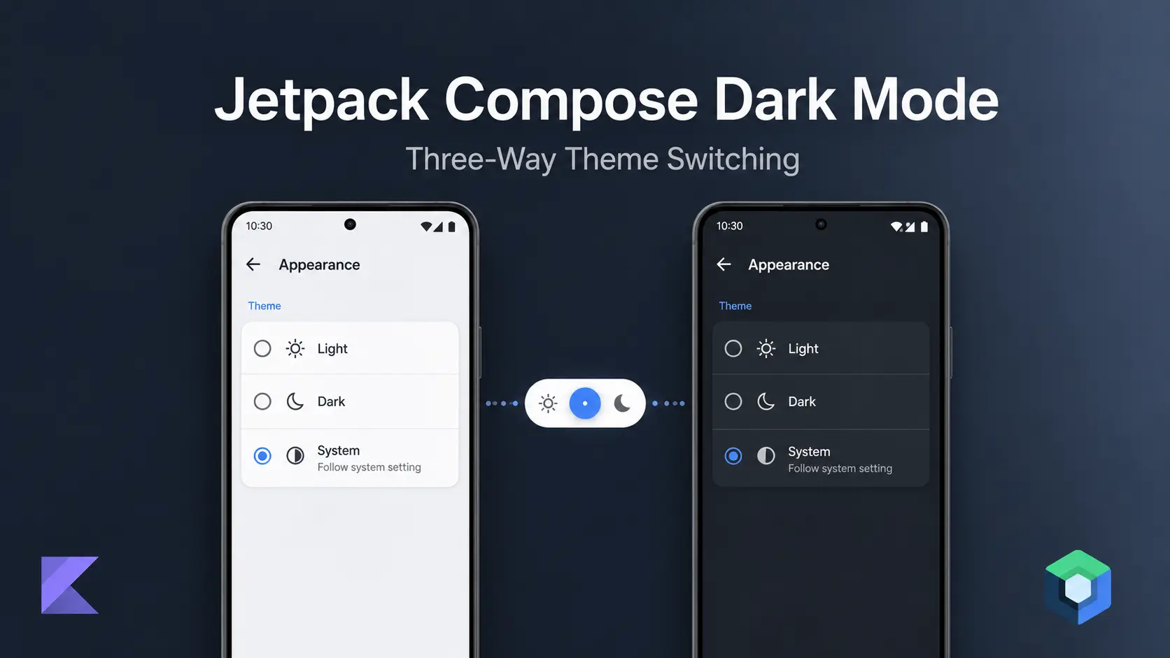
Three-Way ThemeMode Enum: LIGHT, DARK, and SYSTEM
A ThemeMode enum with three values — LIGHT, DARK, and SYSTEM — is the correct foundation for user-controlled dark mode in Jetpack Compose. A boolean can't represent "follow the system."
enum class ThemeMode(val value: Int) {
    LIGHT(0), DARK(1), SYSTEM(2)
}
Storing .value as an Int keeps SharedPreferences simple. SYSTEM defaults to 2 — that's the safe default for a new install.
Persisting the Theme Preference with SharedPreferences
object ThemePreferences {
    private const val PREFS_NAME = "com.example.theme_prefs"
    private const val KEY = "theme_mode"
    private const val DEFAULT = ThemeMode.SYSTEM.value

    private fun prefs() = App.context
        .getSharedPreferences(PREFS_NAME, Context.MODE_PRIVATE)

    var theme: Int
        get() = prefs().getInt(KEY, DEFAULT)
        set(value) { prefs().edit().putInt(KEY, value).apply() }
}
Read it as an Int, map back to ThemeMode via ThemeMode.entries.first { it.value == theme }.
Don't use PreferenceManager.getDefaultSharedPreferences() — it's deprecated in the AndroidX Preference library and will generate lint warnings. getSharedPreferences() directly is the correct call. Don't reach for DataStore here — the synchronous read on startup is actually an advantage when you need the theme value before your first frame.
ThemeViewModel: Persisting Dark Mode with SharedPreferences and StateFlow
This is where most tutorials stop. They update a StateFlow and move on. That's not enough — you also need to persist the choice across restarts.
The ViewModel's job is two writes: persist to SharedPreferences and emit to the StateFlow. AppCompatDelegate belongs in the Activity (covered in the next section). For the broader ViewModel architecture pattern this fits into, see Advanced MVVM Patterns in Jetpack Compose.
class ThemeViewModel : ViewModel() {

    private val _themeMode = MutableStateFlow(
        ThemeMode.entries.first { it.value == ThemePreferences.theme }
    )
    val themeMode: StateFlow<ThemeMode> = _themeMode.asStateFlow()

    fun setTheme(mode: ThemeMode) {
        ThemePreferences.theme = mode.value  // persists across restarts
        _themeMode.value = mode              // drives Compose recomposition
    }
}
Why two writes?
ThemePreferences.theme = mode.value— survives process death. Next cold start reads this before the first frame._themeMode.value = mode— triggers Compose recomposition immediately. The StateFlow is what drives your UI.
Skip the SharedPreferences write and the theme resets on every restart. Skip the StateFlow emit and the UI won't update until the next recomposition trigger.
AppTheme Composable: Wiring darkColorScheme and lightColorScheme
Now the composable that ties it all together.
darkColorScheme() and lightColorScheme() supply safe defaults for all 30 M3 roles — you only need to override the roles your brand cares about. This is the correct way to partially customize M3's color system without instantiating ColorScheme directly (which requires every role to be explicitly set).
isSystemInDarkTheme() is a Compose-aware call that reads the current night-mode state from UiModeManager. Reading it inside a composable automatically triggers recomposition when the system mode changes — no manual observer needed.
@Composable
fun AppTheme(
    themeMode: ThemeMode,
    content: @Composable () -> Unit
) {
    val darkTheme = when (themeMode) {
        ThemeMode.LIGHT  -> false
        ThemeMode.DARK   -> true
        ThemeMode.SYSTEM -> isSystemInDarkTheme()
    }

    val customColors = if (darkTheme) DarkAppColors else LightAppColors

    val colorScheme = if (darkTheme) {
        darkColorScheme(
            primary    = Color(0xFF2C3638),
            secondary  = Color(0xFFBDBDBD),
            background = Color(0xFF1E1F25),
            surface    = Color(0xFF1E1F25),
            onPrimary  = Color.White,
            error      = Color(0xFFB00020),
        )
    } else {
        lightColorScheme(
            primary    = Color(0xFFFBFBFB),
            secondary  = Color(0xFF276EF7),
            background = Color(0xFFFBFBFB),
            surface    = Color(0xFFFBFBFB),
            onPrimary  = Color.Black,
            error      = Color(0xFFB00020),
        )
    }

    MaterialTheme(colorScheme = colorScheme) {
        CompositionLocalProvider(
            LocalCustomColors provides customColors,
            LocalIsDarkTheme provides darkTheme,
        ) {
            content()
        }
    }
}
Two things are happening in parallel here. More on that in the next section.
Why MaterialTheme Alone Isn't Enough: Custom CompositionLocal Color System
This is the part that's worth understanding before you copy the pattern.
Material 3 gives you 30 color roles: primary, onPrimary, primaryContainer, onPrimaryContainer, secondary, error, etc. Those roles are designed around M3's component system. They work well if your app uses M3 components the way Google intended.
But what if you have 195 semantic colors? Colors like cardBackgroundColor, dividerColor, inputFieldBorderColor, tooltipTextColor, sectionHeaderColor. These aren't M3 roles. They're brand-specific semantic names that map to specific visual intentions.
You have two bad options and one good one:
- Bad option 1: Stuff 195 colors into M3 roles by overloading them. Now
surfacemeans three different things depending on context. Future maintainers hate you. - Bad option 2: Nest
MaterialThemecomposables at the component level to patch in custom colors. This causes unnecessary recomposition and makes the theme graph confusing. - Good option: Run a second color system in parallel via
CompositionLocal— the same pattern used for runtime locale switching in Jetpack Compose.
data class AppColors(
    val colorPrimary: Color,
    val backgroundColor: Color,
    val cardBackgroundColor: Color,
    val dividerColor: Color,
    val inputFieldBorderColor: Color,
    val primaryTextColor: Color,
    val sectionHeaderColor: Color,
    // ... 188 more
)

val LightAppColors = AppColors(
    colorPrimary          = Color(0xFF276EF7),
    backgroundColor       = Color(0xFFFBFBFB),
    cardBackgroundColor   = Color(0xFFFFFFFF),
    dividerColor          = Color(0xFFE0E0E0),
    inputFieldBorderColor = Color(0xFFCCCCCC),
    primaryTextColor      = Color(0xFF212121),
    sectionHeaderColor    = Color(0xFF757575),
    // ...
)

val DarkAppColors = AppColors(
    colorPrimary          = Color(0xFFBDBDBD),
    backgroundColor       = Color(0xFF1E1F25),
    cardBackgroundColor   = Color(0xFF2C3638),
    dividerColor          = Color(0xFF3A3A3A),
    inputFieldBorderColor = Color(0xFF555555),
    primaryTextColor      = Color(0xFFEEEEEE),
    sectionHeaderColor    = Color(0xFF9E9E9E),
    // ...
)

val LocalCustomColors = staticCompositionLocalOf { LightAppColors }
val LocalIsDarkTheme  = staticCompositionLocalOf { false }
Then a single access point:
object AppThemeColor {
    val colors: AppColors
        @Composable
        @ReadOnlyComposable
        get() = LocalCustomColors.current
}
Screens use AppThemeColor.colors.cardBackgroundColor instead of MaterialTheme.colorScheme.surface. Clean semantics, no role ambiguity.
The M3 ColorScheme is still there for M3 components that need it (buttons, text fields, navigation rail). You're not throwing M3 away — you're overriding the roles your brand cares about via darkColorScheme()/lightColorScheme() (which supply safe defaults for every unfilled role), and letting your brand system handle everything else.
staticCompositionLocalOf is the right choice here over compositionLocalOf. With compositionLocalOf, Compose tracks each consumer individually and recomposes them on change. With staticCompositionLocalOf, it invalidates the entire subtree — which for a root-level theme swap is exactly what you want, and has lower per-frame overhead since there's nothing to track between changes. Use staticCompositionLocalOf for values that change rarely and affect the whole tree.
Wiring AppCompatDelegate in MainActivity for Dark Mode
AppTheme wraps the entire navigation graph at the root. This is also where AppCompatDelegate lives — reacting to the StateFlow keeps it on the main thread and out of the ViewModel layer.
collectAsStateWithLifecycle() requires androidx.lifecycle:lifecycle-runtime-compose — add it to your dependencies if it's not already there. For a deeper look at collecting StateFlow with lifecycle awareness, the coroutines post covers the underlying mechanics.
class MainActivity : AppCompatActivity() {

    private val themeViewModel: ThemeViewModel by viewModels()

    override fun onCreate(savedInstanceState: Bundle?) {
        super.onCreate(savedInstanceState)

        lifecycleScope.launch {
            themeViewModel.themeMode.collect { mode ->
                AppCompatDelegate.setDefaultNightMode(
                    when (mode) {
                        ThemeMode.LIGHT  -> AppCompatDelegate.MODE_NIGHT_NO
                        ThemeMode.DARK   -> AppCompatDelegate.MODE_NIGHT_YES
                        ThemeMode.SYSTEM -> AppCompatDelegate.MODE_NIGHT_FOLLOW_SYSTEM
                    }
                )
            }
        }

        setContent {
            val themeMode by themeViewModel.themeMode.collectAsStateWithLifecycle()

            AppTheme(themeMode = themeMode) {
                AppNavigation(themeViewModel = themeViewModel)
            }
        }
    }
}
If you have a secondary Activity, apply the same lifecycleScope.launch + collect pattern there. Both Activities share the same ThemePreferences value, so they'll start in the correct mode even before the ViewModel emits.
Building the Settings Toggle
Here's the toggle UI that drives ThemeViewModel.setTheme().
@Composable
fun ThemeSettingsSection(
    currentTheme: ThemeMode,
    onThemeSelected: (ThemeMode) -> Unit
) {
    val options = listOf(
        ThemeMode.LIGHT  to "Light",
        ThemeMode.DARK   to "Dark",
        ThemeMode.SYSTEM to "System default"
    )

    Column {
        Text(
            text = "App theme",
            style = MaterialTheme.typography.labelLarge,
            color = AppThemeColor.colors.sectionHeaderColor
        )

        Spacer(modifier = Modifier.height(8.dp))

        options.forEach { (mode, label) ->
            Row(
                modifier = Modifier
                    .fillMaxWidth()
                    .clickable { onThemeSelected(mode) }
                    .padding(vertical = 12.dp, horizontal = 16.dp),
                verticalAlignment = Alignment.CenterVertically
            ) {
                RadioButton(
                    selected = currentTheme == mode,
                    onClick = { onThemeSelected(mode) }
                )
                Spacer(modifier = Modifier.width(12.dp))
                Text(
                    text = label,
                    style = MaterialTheme.typography.bodyLarge,
                    color = AppThemeColor.colors.primaryTextColor
                )
            }
        }
    }
}
In the parent screen, connect it to the ViewModel:
@Composable
fun SettingsScreen(themeViewModel: ThemeViewModel) {
    val themeMode by themeViewModel.themeMode.collectAsStateWithLifecycle()

    ThemeSettingsSection(
        currentTheme = themeMode,
        onThemeSelected = { themeViewModel.setTheme(it) }
    )
}
For components that need a conditional dark/light value — like an icon tint that doesn't go through AppThemeColor — read LocalIsDarkTheme instead of calling back into the ViewModel:
val isDark = LocalIsDarkTheme.current
val iconTint = if (isDark) Color.White else Color.Black
This keeps the theme decision in the composition tree where it belongs, and avoids duplicating the when(themeMode) resolution logic.
Common Jetpack Compose Dark Mode Mistakes to Avoid
Storing a boolean instead of an enum. A isDarkMode: Boolean flag means you can never represent "follow system." You'll add a second flag later, create a mess, and still miss edge cases. Start with the enum.
Only updating the StateFlow. The StateFlow drives Compose recomposition, but it doesn't persist the choice and it doesn't fix XML-based components. You need all three writes in setTheme().
Reading ThemePreferences inside a composable. Don't do this. SharedPreferences reads are blocking. Read the preference once in the ViewModel on init, expose it via StateFlow, and let Compose observe that.
Skipping AppCompatDelegate at startup. The lifecycleScope collector in MainActivity handles theme changes at runtime, but it runs after the first frame. Without a startup call in Application.onCreate(), the Activity briefly renders in the wrong mode before the collector fires. Add this:
class App : Application() {
    override fun onCreate() {
        super.onCreate()
        AppCompatDelegate.setDefaultNightMode(
            when (ThemeMode.entries.first { it.value == ThemePreferences.theme }) {
                ThemeMode.LIGHT  -> AppCompatDelegate.MODE_NIGHT_NO
                ThemeMode.DARK   -> AppCompatDelegate.MODE_NIGHT_YES
                ThemeMode.SYSTEM -> AppCompatDelegate.MODE_NIGHT_FOLLOW_SYSTEM
            }
        )
    }
}
This reads the persisted preference synchronously before any Activity launches, so the first frame is already in the right mode.
Nested MaterialTheme for per-component overrides. If you find yourself wrapping a single card in MaterialTheme(colorScheme = someOtherScheme), that's a sign your color semantic layer isn't working. Add the color to AppColors instead and keep the theme tree flat.
FAQ
Can I use DataStore instead of SharedPreferences for the theme preference?
SharedPreferences is the better choice for a theme preference because its synchronous getInt() read completes before the first frame, preventing flicker on cold start. DataStore reads are asynchronous — you'd need a splash or loading state to compensate, adding complexity for no meaningful benefit in this specific case. Save DataStore for preferences that don't affect the initial render.
Why not use DynamicColorScheme from Material 3?
Dynamic color pulls wallpaper-derived colors from the system on Android 12+. If your app has a strong brand palette — specific blues, specific grays — dynamic color will override it. The pattern here intentionally uses a fixed brand palette. Dynamic color and brand colors are opposing choices; pick one based on your product requirements.
What happens on Android versions below API 29 (below Android 10)?
On API 28 and below, isSystemInDarkTheme() always returns false because those Android versions don't support system dark mode — so ThemeMode.SYSTEM effectively behaves like ThemeMode.LIGHT in Compose. One caveat: AppCompatDelegate.MODE_NIGHT_FOLLOW_SYSTEM on pre-Q devices follows battery saver state rather than a dark mode toggle, so there can be a slight divergence between what isSystemInDarkTheme() returns and what AppCompatDelegate applies to XML-based Activities. For most apps this edge case doesn't matter. Users on older devices can always manually pick DARK from Settings.
Do I need to recreate the Activity after calling AppCompatDelegate.setDefaultNightMode()?
No, not in a pure Compose Activity — Compose recomposition driven by the StateFlow handles the visual update without recreating the Activity. The AppCompatDelegate call is there for XML-based Activities.
For hybrid apps: do not add android:configChanges="uiMode" to your manifest unless you know what you're doing. Without that flag, the system recreates XML Activities automatically on a uiMode change — that's the correct behavior. Adding the flag suppresses recreation and requires you to handle onConfigurationChanged() yourself. For most apps, omitting it is the right call.
How do I apply AppTheme to Compose previews?
Wrap your preview composable in AppTheme(themeMode = ThemeMode.DARK) directly. Since ThemeMode is a plain enum with no dependencies, you don't need a fake ViewModel in previews:
@Preview(name = "Dark theme", uiMode = Configuration.UI_MODE_NIGHT_YES)
@Composable
fun MyScreenPreview() {
    AppTheme(themeMode = ThemeMode.DARK) {
        MyScreen()
    }
}
Key Takeaways
- Use a three-value enum, not a boolean.
LIGHT,DARK,SYSTEMcovers every real user need without hacks. - ViewModel writes two places: SharedPreferences + StateFlow.
AppCompatDelegatebelongs in the Activity reacting to the StateFlow, not in the ViewModel. - Run a custom
CompositionLocalalongside M3 ColorScheme. M3's 30 roles are a foundation, not a ceiling. Brand-specific semantics belong in your ownAppColorsdata class. - Keep
AppThemeat the root. One theme tree, no per-screen overrides. Components readAppThemeColor.colors.*andLocalIsDarkTheme.current— never back-channel into the ViewModel. - Restore
AppCompatDelegateinApplication.onCreate()before the first frame. Without this startup call, the first Activity flickers to the wrong theme.


