Android ConstraintLayout has become the default for everything — and that's the problem. Login screen with three centered fields? ConstraintLayout. Simple vertical list of TextViews? ConstraintLayout. Every extra constraint adds parsing overhead, and most layouts that use it would render identically with a LinearLayout and half the XML.
Here's the honest version: in years of profiling Android UIs, I've never found a 2-level nested LinearLayout to be the bottleneck. ConstraintLayout earns its complexity in specific situations — and this post is about identifying those situations, not making it the default answer to every layout problem.
What this post covers (jump to any section):
- How ConstraintLayout works under the hood — why the Cassowary constraint solver lets it flatten 4 levels of LinearLayout into one
- Chains, guidelines, barriers, and aspect ratios — what they do and when you actually need them
- The
match_parentvs0dpmistake that silently breaks layouts (plus 3 more) - A real product card combining barriers and baseline alignment
- Performance: when flat hierarchy actually matters
- Should you use it in Jetpack Compose?
The performance angle is real but narrower than people think. A flat hierarchy means fewer measure passes in XML and fewer recomposition scope boundaries in Compose — but the gain only shows up at scale (RecyclerView items, 20+ view screens, low-end devices). For a static screen with eight views, the difference is invisible. The official Android ConstraintLayout documentation covers the API surface; this post is about when the API earns its complexity.
How Android ConstraintLayout Works Under the Hood
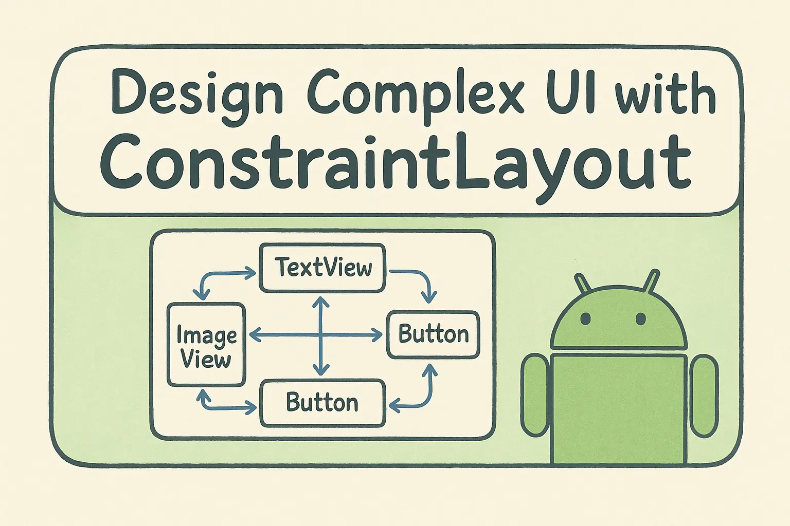
The basic idea: instead of nesting layouts inside layouts, you define relationships between views. "This view's top is 16dp below that view's bottom." "This view is centered horizontally in its parent." The layout system solves all these constraints to figure out where everything goes.
Under the hood, it builds a system of linear equations from your constraints and solves them using the Cassowary constraint solver — the same algorithm that powers Apple's Auto Layout. That's why you can express relationships that would be impossible with nested LinearLayouts.
The practical benefit: you get a flat view hierarchy. Instead of 4-5 levels of nested layouts, you have one ConstraintLayout with all your views as direct children. This matters for performance because every level of nesting adds measure/layout passes.
When to Use ConstraintLayout in Android
ConstraintLayout earns its complexity in four specific situations:
- Complex cross-axis alignment. When you need to center something vertically while also aligning it to another view's edge horizontally. Try doing that with nested LinearLayouts — it gets ugly fast.
- Responsive layouts. Percentage-based sizing, aspect ratios, and bias values let you build layouts that adapt to different screen sizes without writing different XML files.
- Replacing deep nesting (especially migrating from RelativeLayout). If you have a layout that's 4+ levels deep with
LinearLayoutandRelativeLayout— common in older codebases — ConstraintLayout can usually flatten it into a single parent. RelativeLayout-to-ConstraintLayout migration is one of the highest-ROI refactors in legacy Android UIs. - As the base for MotionLayout.
MotionLayoutextends ConstraintLayout, so any property animation you build with MotionLayout is configured using ConstraintLayout constraints. If animated transitions are on your roadmap, the ConstraintLayout you build today becomes the starting state for tomorrow's MotionScene.
When to Use LinearLayout Instead of ConstraintLayout
Simple vertical stacks. Three TextViews in a column? Use LinearLayout. The constraint syntax just adds noise:
<!-- ConstraintLayout: 12+ lines, IDs required, 4 constraints per view -->
<TextView
    android:id="@+id/title"
    app:layout_constraintTop_toTopOf="parent"
    app:layout_constraintStart_toStartOf="parent" />
<TextView
    android:id="@+id/subtitle"
    app:layout_constraintTop_toBottomOf="@id/title"
    app:layout_constraintStart_toStartOf="parent" />
<!-- ...and so on -->

<!-- LinearLayout: 5 lines, zero IDs needed -->
<LinearLayout android:orientation="vertical">
    <TextView android:text="Title" />
    <TextView android:text="Subtitle" />
    <TextView android:text="Description" />
</LinearLayout>
A bottom sheet with title + body + dismiss button doesn't need 18 constraint attributes. Code review diffs are also easier to read with fewer attributes per view — actual changes stand out instead of getting lost in constraint plumbing.
Simple horizontal rows. A toolbar with an icon and two text labels? LinearLayout with orientation="horizontal" and gravity="center_vertical" is two lines. The same thing in ConstraintLayout needs 9 constraints across 3 views — and you have to remember which view is the "anchor" if you ever reorder them.
Quick prototypes. When you're iterating on a screen layout and don't yet know the final structure, LinearLayout lets you reorder views by cut-and-paste. Reordering in ConstraintLayout means updating constraint references on neighboring views — a small reorder can cascade into 5 attribute edits.
Simple RecyclerView items. Counterintuitively, very simple list items (avatar + text + chevron) can be faster as a LinearLayout because the constraint solver has per-view overhead. ConstraintLayout wins for complex items with 8+ views; for 3-view items it's a wash or slightly slower.
ConstraintLayout Chains, Guidelines, Barriers & Aspect Ratios
Chains
A chain is a bidirectional constraint between two or more views that lets you distribute them along an axis — like flexbox's justify-content, but in XML. When you link views into a chain, the chain's "head" (leftmost or topmost view) controls the distribution style for the whole group. Without chains, you'd have to calculate margins manually or nest a LinearLayout just to space three buttons evenly.
Use chains any time you need views distributed across an axis without hardcoding positions — tab bars, button rows, icon groups.
The three chain styles:
- Spread — equal spacing between views. Good for tab bars.
- Spread Inside — first and last views touch the edges, others spaced evenly. Good for toolbars with icons at both ends.
- Packed — views grouped together, can be positioned with bias. Good for centered button groups.
Example — three buttons spread across the width:
<Button
    android:id="@+id/btn1"
    app:layout_constraintHorizontal_chainStyle="spread"
    app:layout_constraintStart_toStartOf="parent"
    app:layout_constraintEnd_toStartOf="@id/btn2" />

<Button
    android:id="@+id/btn2"
    app:layout_constraintStart_toEndOf="@id/btn1"
    app:layout_constraintEnd_toStartOf="@id/btn3" />

<Button
    android:id="@+id/btn3"
    app:layout_constraintStart_toEndOf="@id/btn2"
    app:layout_constraintEnd_toEndOf="parent" />
Guidelines
Invisible lines you can constrain to. Useful for consistent alignment across a screen.
<!-- 30% from the left -->
<androidx.constraintlayout.widget.Guideline
    android:id="@+id/guideline"
    android:orientation="vertical"
    app:layout_constraintGuide_percent="0.30" />

<!-- This image stays in the left 30% -->
<ImageView
    app:layout_constraintStart_toStartOf="parent"
    app:layout_constraintEnd_toStartOf="@id/guideline" />
Barriers
A Barrier is a virtual boundary that positions itself at the outermost edge of a group of views you specify. Unlike a Guideline (which sits at a fixed position), a Barrier moves at runtime — if one of its referenced views grows because of a longer text string or a different locale, the Barrier shifts to stay outside it.
Use it whenever you have a column of labels with unpredictable lengths and want the adjacent views to always start at a consistent offset — the classic form label + input field pattern.
<!-- Barrier positioned after the longest label -->
<androidx.constraintlayout.widget.Barrier
    android:id="@+id/labelBarrier"
    app:barrierDirection="end"
    app:constraint_referenced_ids="label1,label2,label3" />

<!-- Input field starts after the barrier -->
<EditText
    app:layout_constraintStart_toEndOf="@id/labelBarrier" />
Aspect Ratios
Force a view to maintain proportions:
<ImageView
    android:layout_width="0dp"
    android:layout_height="0dp"
    app:layout_constraintDimensionRatio="16:9"
    app:layout_constraintStart_toStartOf="parent"
    app:layout_constraintEnd_toEndOf="parent" />
The image fills the width and calculates height to maintain 16:9.
4 Layout Mistakes That Break Silently
These four mistakes all compile fine. They don't throw exceptions, they don't show red lines in Android Studio — they just produce layouts that quietly behave wrong. I've shipped each of them at least once.
Using match_parent instead of 0dp (MATCH_CONSTRAINT)
<!-- Wrong - don't use match_parent in ConstraintLayout -->
<TextView
    android:layout_width="match_parent"
    app:layout_constraintStart_toStartOf="parent"
    app:layout_constraintEnd_toEndOf="parent" />

<!-- Right - use 0dp (MATCH_CONSTRAINT) -->
<TextView
    android:layout_width="0dp"
    app:layout_constraintStart_toStartOf="parent"
    app:layout_constraintEnd_toEndOf="parent" />
match_parent doesn't consider constraints. 0dp means "size me based on my constraints."
Missing constraints
Every view needs at least one horizontal and one vertical constraint. If you only constrain the top, the horizontal position is undefined and the view will jump to 0,0.
<!-- Missing horizontal constraint - view position undefined -->
<TextView
    app:layout_constraintTop_toTopOf="parent" />

<!-- Fixed -->
<TextView
    app:layout_constraintTop_toTopOf="parent"
    app:layout_constraintStart_toStartOf="parent" />
Android Studio shows warnings for this, but they're easy to ignore when you're in a hurry.
Circular dependencies
<!-- These depend on each other - impossible to solve -->
<TextView
    android:id="@+id/text1"
    app:layout_constraintTop_toBottomOf="@id/text2" />

<TextView
    android:id="@+id/text2"
    app:layout_constraintTop_toBottomOf="@id/text1" />
The fix is usually to anchor one view to the parent instead of each other.
Over-constraining (silently dropped attributes)
layout_constraintWidth_percent only takes effect when layout_width="0dp". If you set a fixed width, the percent value is silently ignored — no warning, no error, the layout just doesn't behave the way you expect:
<!-- Wrong - percent attribute is silently ignored because width is fixed -->
<TextView
    android:layout_width="100dp"
    app:layout_constraintWidth_percent="0.5" />

<!-- Right - 0dp width makes percent take effect -->
<TextView
    android:layout_width="0dp"
    app:layout_constraintWidth_percent="0.5"
    app:layout_constraintStart_toStartOf="parent" />
The same rule applies to layout_constraintWidth_default="spread", layout_constraintWidth_min, and layout_constraintWidth_max — they all require layout_width="0dp" to do anything.
Android ConstraintLayout Example: Product Card with Barrier
Here's a product card that uses several ConstraintLayout features:
<androidx.constraintlayout.widget.ConstraintLayout
    android:layout_width="match_parent"
    android:layout_height="wrap_content"
    android:padding="12dp">

    <!-- Square product image - width fills parent, height derived from W,1:1 ratio -->
    <ImageView
        android:id="@+id/productImage"
        android:layout_width="0dp"
        android:layout_height="0dp"
        app:layout_constraintDimensionRatio="W,1:1"
        app:layout_constraintTop_toTopOf="parent"
        app:layout_constraintStart_toStartOf="parent"
        app:layout_constraintEnd_toEndOf="parent" />

    <!-- Title below image -->
    <TextView
        android:id="@+id/productTitle"
        android:layout_width="0dp"
        android:layout_height="wrap_content"
        android:layout_marginTop="8dp"
        android:maxLines="2"
        app:layout_constraintTop_toBottomOf="@id/productImage"
        app:layout_constraintStart_toStartOf="parent"
        app:layout_constraintEnd_toEndOf="parent" />

    <!-- Sale price -->
    <TextView
        android:id="@+id/salePrice"
        android:layout_width="wrap_content"
        android:layout_height="wrap_content"
        android:layout_marginTop="4dp"
        android:textStyle="bold"
        app:layout_constraintTop_toBottomOf="@id/productTitle"
        app:layout_constraintStart_toStartOf="parent" />

    <!-- Original price (baseline aligned with sale price) -->
    <TextView
        android:id="@+id/originalPrice"
        android:layout_width="wrap_content"
        android:layout_height="wrap_content"
        android:layout_marginStart="8dp"
        app:layout_constraintBaseline_toBaselineOf="@id/salePrice"
        app:layout_constraintStart_toEndOf="@id/salePrice" />

    <!-- Barrier sits at the end of whichever price text is wider -->
    <androidx.constraintlayout.widget.Barrier
        android:id="@+id/priceBarrier"
        app:barrierDirection="end"
        app:constraint_referenced_ids="salePrice,originalPrice" />

    <!-- Add to cart button starts AFTER the barrier - never overlaps the prices -->
    <Button
        android:id="@+id/addToCartButton"
        android:layout_width="wrap_content"
        android:layout_height="wrap_content"
        android:text="Add"
        android:layout_marginStart="8dp"
        app:layout_constraintBaseline_toBaselineOf="@id/salePrice"
        app:layout_constraintStart_toEndOf="@id/priceBarrier"
        app:layout_constraintEnd_toEndOf="parent"
        app:layout_constraintHorizontal_bias="1.0" />

</androidx.constraintlayout.widget.ConstraintLayout>
What's happening here:
dimensionRatio="W,1:1"keeps the image square — width fills the parent, height is derived from width. TheW,prefix tells the solver which dimension drives the ratio when both are0dp.constraintBaseline_toBaselineOfaligns the sale price, original price, and button text on the same text baseline — looks better than top-aligning views with different text sizes.- The Barrier sits at the right edge of whichever price text is wider, and the button's
constraintStart_toEndOf="@id/priceBarrier"ties the button's left edge to it. So when "Original Price" is longer than "Sale Price" (or vice versa), the button shifts automatically — no overlap, no manual width calculations.
This would require 3-4 nested layouts without ConstraintLayout.
The Performance Tradeoff: When Flat Hierarchy Actually Matters
In years of profiling Android apps, I've never found a 2-level nested LinearLayout to be the bottleneck. If your frame times are bad, the cause is almost always something else — overdraw, expensive onMeasure in a custom view, large bitmaps being decoded on the main thread, or recomposition storms in Compose.
That said, the flat-hierarchy benefit is real in specific situations:
Where it actually moves the needle:
- RecyclerView items inflated thousands of times — saving 0.2ms per item adds up when you scroll a 1,000-row list
- Complex screens on low-end devices — weaker CPUs feel every extra measure pass
- Layouts with 20+ views — measure/layout complexity is roughly O(n × depth), and depth dominates
Where it doesn't:
- Screens with under 10 views
- Loading screens, splash screens, anything users see briefly
- High-end devices where rendering budget is generous
Run a Layout Inspector trace before you refactor. Don't flatten every LinearLayout speculatively — measure first, find the slow screen, then rewrite that one.
Should You Use ConstraintLayout in Jetpack Compose?
Compose has its own ConstraintLayout implementation. The syntax is different but the concepts are the same:
ConstraintLayout(modifier = Modifier.fillMaxSize()) {
    val (image, title, subtitle) = createRefs()

    Image(
        painter = painterResource(id = R.drawable.product_placeholder),
        contentDescription = null,
        modifier = Modifier.constrainAs(image) {
            top.linkTo(parent.top)
            start.linkTo(parent.start)
        }
    )

    Text(
        text = "Product title",
        modifier = Modifier.constrainAs(title) {
            top.linkTo(image.bottom, margin = 8.dp)
            start.linkTo(parent.start)
        }
    )

    Text(
        text = "Subtitle goes here",
        modifier = Modifier.constrainAs(subtitle) {
            top.linkTo(title.bottom, margin = 4.dp)
            start.linkTo(parent.start)
        }
    )
}
Honestly, I rarely reach for it in Compose. Box, Row, and Column handle 90% of layouts cleanly. The cases where I do use ConstraintLayout in Compose:
- Baseline-aligning text across composables that don't share a
Row. Inside a singleRowyou can useModifier.alignByBaseline()orModifier.alignBy(FirstBaseline)to baseline-align children. The harder case is aligning text baselines across composables in different parents — say, aTextin one section and aButtonlabel two rows down. That's where ConstraintLayout'slinkTo(other.baseline)is the cleanest fix. - Percentage-based positioning using
Guideline. Compose has no built-in equivalent — there'sModifier.fillMaxWidth(0.6f)for sizing, but positioning "30% from the start" requires eitherBoxWithConstraintsmath or aConstraintLayoutwith a vertical guideline. - Sizing relative to the widest of a group. Equivalent to XML
Barrier. Useful for label columns where each label has a different length but you want all the input fields to start at the same x-position.
For everything else, nesting Box and Column is clearer than wiring up constraint references. Compose's single-pass measurement system also weakens the performance argument that justifies ConstraintLayout in XML. See Row, Column, Box, and ConstraintLayout compared in Jetpack Compose for a side-by-side breakdown of when each one wins.
The Decision Rule: When Complexity Pays Off
Reach for ConstraintLayout when you find yourself doing one of these:
- Nesting 3+ levels of
LinearLayoutorFrameLayout - Baseline-aligning text across views of different types
- Percentage-based positioning (e.g. "title sits in the left 60% of the screen")
- Building a layout that needs to react to the longest item in a group (Barrier)
For everything else, start with LinearLayout — or Row/Column in Compose — and only switch when the simpler layout actually fights you.
Try this on your current project right now: open the screen with the most nesting in Layout Inspector. Count the depth. If anything's at 4+ levels, that's a candidate for flattening with ConstraintLayout. Most Android codebases have exactly one or two screens that genuinely need it — not every screen, not most screens.
The goal isn't to use ConstraintLayout everywhere. It's to recognize the specific situations where it earns the complexity, and keep everything else simple.
FAQ
When should I use ConstraintLayout instead of LinearLayout?
Use ConstraintLayout when your layout needs cross-axis alignment, percentage-based sizing, or you're already at 3+ levels of nesting. For simple vertical stacks or basic horizontal rows, LinearLayout is less code and just as fast. The complexity of ConstraintLayout only pays off when the problem actually requires it — which is maybe 20-30% of screens in a typical app.
What is a Barrier in ConstraintLayout?
A Barrier is a virtual view that dynamically tracks the outermost edge of a group of views. You reference multiple views by ID, set a direction (start, end, top, bottom), and the Barrier positions itself just outside whichever view extends furthest in that direction. It solves the "form labels of different lengths" problem cleanly — input fields constrain to the Barrier, so they always start at the same x-position regardless of how long each label is.
Does ConstraintLayout improve Android app performance?
It can, but the gains are narrower than the docs suggest. A flat view hierarchy reduces measure passes, which helps on complex screens with 20+ views, low-end devices, or RecyclerView items inflated thousands of times. For a simple screen with eight views on a mid-range device, the difference is unmeasurable. Profile first with Layout Inspector — don't refactor every screen speculatively based on the assumption that flat is always faster.
Should I use ConstraintLayout in Jetpack Compose?
Only for specific cases. Compose's Box, Row, and Column handle the vast majority of layouts, and Compose's single-pass measurement already removes the nesting-penalty that makes ConstraintLayout worthwhile in XML. Reach for it in Compose when you need cross-composable baseline alignment, a percentage-based Guideline, or a Barrier equivalent for sizing views relative to the widest in a group. For everything else, nested composables are clearer and easier to maintain.


