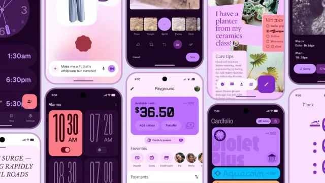
Material 3 Expressive is Google's most heavily validated Android design update — 46 rounds of user research, 18,000 participants, and a clear goal: make Android UI feel more human and less clinical. It shipped officially with Android 16.
If you're building with Jetpack Compose, this post covers exactly what changed in the components and what you need to update in your app.
What this post covers:
- What's visually different in M3 Expressive vs standard Material 3 (with specific values)
- How to update your Compose theme, typography, and components
- Breaking changes: spacing, touch targets, and animation speed
- A pre-upgrade checklist before you migrate
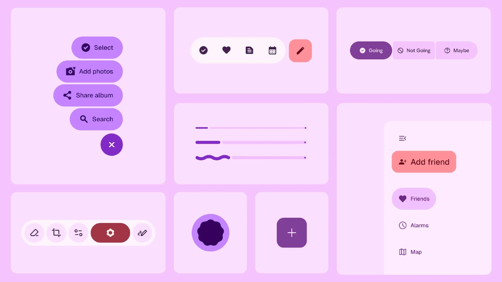
Image Credit: Google
What's New in Material 3 Expressive vs Material 3
From what the leaked blog revealed, Google is pushing Android's visual design in a more "emotional" direction. Bigger text, rounder corners, more pronounced shadows, and what they're calling "emotion-driven UX."
Translation: things look friendlier and more playful. Whether that's good or bad depends on your taste, but it's definitely different from the more utilitarian look of current Material 3.
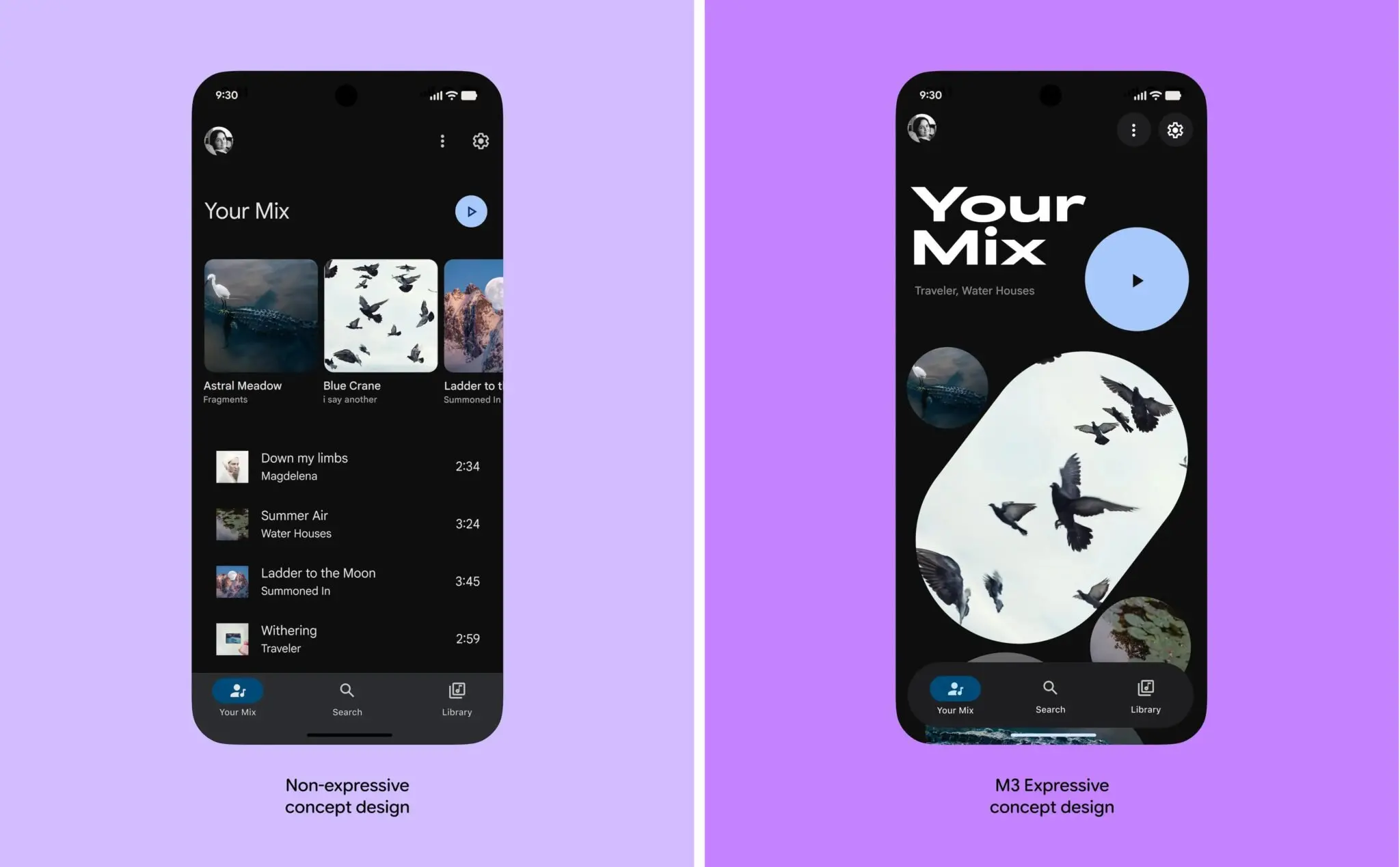
Image Credit: Google
The changes include new widgets, enhanced theming controls, and what sounds like significantly improved customization options. For developers using Jetpack Compose, these components should integrate smoothly with existing Compose code.
One thing worth noting: the full experience will probably only be available on Pixel phones initially. Samsung, OnePlus, Xiaomi - they all have their own design languages layered on top of Android, so how much of Material 3 Expressive makes it to those devices is anyone's guess.
How to Migrate Your Jetpack Compose App to Material 3 Expressive
If you're building Android apps, here's what you actually need to know.
The Visual Changes
The core components are getting updated styling:
Buttons - Rounder corners (think 16dp instead of 12dp), more pronounced elevation on press, larger touch targets. If you've hardcoded corner radii, you might want to update them.
Cards - More shadow, rounder corners, generally "softer" appearance.
Typography - Bolder, larger. The display and headline styles are noticeably heavier than before.
Colors - The palette is more vibrant. Dynamic color (pulling from wallpaper) is being pushed even harder.
Updating Your Dependencies
If you want to start experimenting with the new styles:
dependencies {
    implementation("androidx.compose.material3:material3:1.3.0")
    implementation("androidx.compose.material3:material3-window-size-class:1.3.0")
}
Setting Up Themes
Here's a basic theme setup that embraces the new design direction:
@Composable
fun AppTheme(
    darkTheme: Boolean = isSystemInDarkTheme(),
    dynamicColor: Boolean = true,
    content: @Composable () -> Unit
) {
    val colorScheme = when {
        dynamicColor && Build.VERSION.SDK_INT >= Build.VERSION_CODES.S -> {
            val context = LocalContext.current
            if (darkTheme) dynamicDarkColorScheme(context)
            else dynamicLightColorScheme(context)
        }
        darkTheme -> darkColorScheme(
            primary = Color(0xFF6750A4),
            onPrimary = Color(0xFFFFFFFF),
            primaryContainer = Color(0xFFEADDFF),
            onPrimaryContainer = Color(0xFF21005D)
        )
        else -> lightColorScheme(
            primary = Color(0xFF6750A4),
            onPrimary = Color(0xFFFFFFFF),
            primaryContainer = Color(0xFFEADDFF),
            onPrimaryContainer = Color(0xFF21005D)
        )
    }

    MaterialTheme(
        colorScheme = colorScheme,
        typography = AppTypography,
        content = content
    )
}
The Typography Scale
The new typography is bolder. Here's what the scale looks like:
val AppTypography = Typography(
    displayLarge = TextStyle(
        fontSize = 57.sp,
        lineHeight = 64.sp,
        fontWeight = FontWeight.Bold,
        letterSpacing = (-0.25).sp
    ),
    headlineLarge = TextStyle(
        fontSize = 32.sp,
        lineHeight = 40.sp,
        fontWeight = FontWeight.Bold
    ),
    titleLarge = TextStyle(
        fontSize = 22.sp,
        lineHeight = 28.sp,
        fontWeight = FontWeight.SemiBold
    ),
    bodyLarge = TextStyle(
        fontSize = 16.sp,
        lineHeight = 24.sp,
        fontWeight = FontWeight.Normal
    )
)
Component Examples
Here's what "expressive" buttons look like in practice:
@Composable
fun ActionButtons() {
    Column(
        modifier = Modifier.padding(16.dp),
        verticalArrangement = Arrangement.spacedBy(12.dp)
    ) {
        Button(
            onClick = { /* action */ },
            modifier = Modifier.fillMaxWidth(),
            shape = RoundedCornerShape(16.dp),
            elevation = ButtonDefaults.buttonElevation(
                defaultElevation = 4.dp,
                pressedElevation = 8.dp
            )
        ) {
            Icon(Icons.Filled.Favorite, contentDescription = null)
            Spacer(Modifier.width(8.dp))
            Text("Primary Action", fontSize = 16.sp)
        }

        FilledTonalButton(
            onClick = { /* action */ },
            modifier = Modifier.fillMaxWidth(),
            shape = RoundedCornerShape(16.dp)
        ) {
            Text("Secondary Action", fontSize = 16.sp)
        }
    }
}
And an example card with the new styling:
@Composable
fun ContentCard(
    title: String,
    description: String,
    icon: ImageVector,
    onClick: () -> Unit
) {
    Card(
        onClick = onClick,
        modifier = Modifier
            .fillMaxWidth()
            .padding(horizontal = 16.dp),
        shape = RoundedCornerShape(20.dp),
        elevation = CardDefaults.cardElevation(
            defaultElevation = 2.dp,
            pressedElevation = 8.dp
        ),
        colors = CardDefaults.cardColors(
            containerColor = MaterialTheme.colorScheme.surfaceVariant
        )
    ) {
        Row(
            modifier = Modifier
                .padding(20.dp)
                .fillMaxWidth(),
            horizontalArrangement = Arrangement.SpaceBetween,
            verticalAlignment = Alignment.CenterVertically
        ) {
            Column(modifier = Modifier.weight(1f)) {
                Text(
                    text = title,
                    style = MaterialTheme.typography.titleLarge,
                    fontWeight = FontWeight.Bold
                )
                Spacer(modifier = Modifier.height(8.dp))
                Text(
                    text = description,
                    style = MaterialTheme.typography.bodyMedium,
                    color = MaterialTheme.colorScheme.onSurfaceVariant
                )
            }
            Icon(
                imageVector = icon,
                contentDescription = null,
                modifier = Modifier.size(48.dp),
                tint = MaterialTheme.colorScheme.primary
            )
        }
    }
}
Breaking Changes: Spacing, Touch Targets, and Animation Speed
A few potential gotchas if you're migrating:
Default spacing increased - Some components have moved from 8dp to 12dp default spacing. If your layouts are pixel-perfect, check them.
Touch targets are strictly 48dp - This was always the guideline, but it's being enforced more consistently. Good for accessibility, potentially annoying if you have cramped UIs.
Animations are slower - The default animation durations are slightly longer. Feels more "premium" but also means interactions feel slightly less snappy.
M3 Expressive Migration Checklist
Before you update your app, work through these in order:
- [ ] Update dependencies — bump
material3to1.3.0+andmaterial3-window-size-classto match - [ ] Audit hardcoded corner radii — buttons moved from 12dp to 16dp, cards from 4dp to 20dp; search your codebase for
RoundedCornerShape(12.dp)and similar - [ ] Check touch targets — anything interactive under 48dp height will trigger accessibility warnings; M3 Expressive enforces this more consistently
- [ ] Review typography weights — headline styles moved from
SemiBoldtoBold; if you've subclassedTypographywith custom weights, compare against the new scale - [ ] Test animation timing — default durations are ~15% longer; if you have time-sensitive interactions (e.g. auto-dismissing snackbars), verify they still feel right
- [ ] Check default spacing — component internal padding increased from 8dp to 12dp in several components; pixel-perfect layouts will shift
- [ ] Dark theme — the Expressive color roles have slightly different contrast ratios; run your dark theme through an accessibility checker after updating
- [ ] Dynamic color (Android 12+) — if you use
dynamicDarkColorSchemeordynamicLightColorScheme, test on Android 16 specifically — wallpaper color extraction behavior changed
If you use a custom dark/light theme setup in Jetpack Compose, pay special attention to the color role changes — the surfaceVariant and onSurfaceVariant roles have shifted in the Expressive palette.
For layout-level changes, the Row, Column, Box, and ConstraintLayout guide covers how spacing changes in parent composables ripple through to child layout calculations.
Should You Upgrade to Material 3 Expressive Now?
M3 Expressive is a meaningful visual update — not just rounder corners, but a coherent shift toward warmer, more emotionally resonant UI. The research behind it (46 rounds, 18,000 participants) shows in the attention to detail.
That said, the "emotion-driven UX" marketing language oversells it. It is rounder corners and bolder text — that's actually fine. Good UI improvements don't need to sound like a paradigm shift.
If you're building a new app: start with M3 Expressive from day one. The defaults are better.
If you have an existing app: work through the checklist above, then update screens as you touch them for other reasons. Nothing in M3 Expressive is so urgent it warrants a dedicated migration sprint unless you're targeting Android 16 specifically.
For more on Android UI development, check out our guides on Jetpack Compose strengths and production patterns and Android ConstraintLayout chains and barriers.